Previous articles in this series:
- 1. Motivations and Methods
- 2. Obtaining OpenStreetMap data
- 3. Manipulating geodata with GeoPandas
- 4. Cleaning text data with fuzzywuzzy
- 5. Building a street name classifier with scikit-learn
- 6. Adding features with Pipelines and Feature Unions
A web map in two lines of Python
Here’s how to make a map from a GeoPandas GeoDataFrame in one step:
ax = df.plot(column='classification', colormap='accent')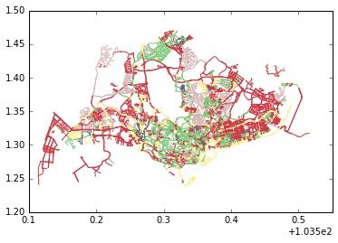
where classification was the name of the column with our new
Malay/Chinese/British/Indian/Generic/Other labels on each road (row).
What if we want to make this nice and interactive, like a Leaflet map? So we can pan and zoom and actually see street names? There’s a library called mplleaflet, by Jake Wasserman, that can do this for you:
import mplleaflet
mplleaflet.display(fig=ax.figure, crs=df.crs, tiles='cartodb_positron')
(If you don’t see colours on that map, just reload the page.)
To export it to an HTML page, you can do this:
mplleaflet.show(fig=ax.figure, crs=df.crs, tiles='cartodb_positron', path='sgmap.html')We don’t have much control over colours here, but it would be nice to theme them, associating Chinese with its traditional red, Malay with its traditional green, etc. Here’s a hacky way to do it:
labels = list(set(df['classification'].values))
labels.sort()
# [u'British', u'Chinese', u'Generic', u'Indian', u'Malay', u'Other']
# this is the order in which colours from a colourmap will be applied

# British -> blue, Chinese -> red, etc...
my_colors = ['blue', 'red', 'gray', 'yellow', 'green', 'purple'])

# create a colour map with these colours
from matplotlib.colors import LinearSegmentedColormap
cmap = LinearSegmentedColormap.from_list('my cmap', my_colors)

# do the plot
ax2 = df.plot(column='classification', colormap=cmap)
mplleaflet.show(fig=ax2.figure, crs=df.crs, tiles='cartodb_positron', path='sgmap2.html')
Alternatives
mplleaflet is awesome for exploratory data analysis, but you might want to have more control over how your map looks. For this, I recommend using one of the following:
- QGIS (C++ but has Python bindings)
- Mapnik (C++ but has Python bindings)
- Tilemill (GUI built on top of Mapnik)
- Folium (maybe, haven’t investigated fully)
A nice feature of Tilemill is that it allows you to define your map styling using CartoCSS. For example, here’s how we would define the colours:
[classification='Malay']{ line-color: green; }
[classification='British']{ line-color: blue; }
[classification='Chinese']{ line-color: red; }
[classification='Indian']{ line-color: yellow; }
[classification='Other']{ line-color: purple; }
[classification='Generic']{ line-color: gray; }
You can also control the line width at various zoom levels:
line-opacity: 0.7;
[zoom>18] {line-width: 10;}
[zoom=18] {line-width: 7;}
[zoom=17] {line-width: 6;}
[zoom=16] {line-width: 5;}
[zoom=15] {line-width: 3.5;}
[zoom=14] {line-width: 3;}
[zoom=13] {line-width: 1.5;}
[zoom<13] {line-width: 1;}
If these are too fiddly, some web mapping solutions also use CartoCSS. I really like CartoDB, which is how I made my main map:
We can browse this map to look at clusters of street names, which are now conveniently colour-coded for our analysis!
Conclusion
It’s remarkably easy to make maps with GeoPandas and ancillary libraries like mplleaflet, thanks to the developers of these libraries :)
That’s all the technical stuff in this series. Next time, I’ll round everything off and talk about what I learned about Singapore street names from doing this project.